Beginning the new Round of Travelling or Circling Journals.
The new round of traveling journals begin in AASG on July 1st. It was with both excited anticipation and anxious nervousness that most of us waited to pop our journal in the mail box on or close to the 1st. As I had only a few days previously welcomed home my traveling journal from 2015 I felt a bit like I was just doing the next journal in the round. My new theme was "House" not "Home" as I had done a journal called home some years ago in another group. After deciding on the theme a month or so ago, I was still a bit uncertain what I was going to do in my journal myself. I am in round #4 group.
My journal is a handmade one created especially for me by Julia Deane. It is Stonehenge watercolour of 285gsm so should stand up to any mixed media thrown at it. It measures 9inch by 9inch and is about 10 double page layouts including the cover.
I painted the front and back cover in dylusions and other acrylic paints. The front was done in colour blocks and the back was just a "lets put paint on and see where it lands" situation. The colours I used were greens, yellows, orange and blue. I then used various wall stencils to further enhance the back and front.
I used house stencils from Mike Deakin Art on the back and a couple on the front of the cover. The beach house stencil, was one I had in my stash for about 20 yrs and originally used on tiles in a kitchen I renovated in an previous house I lived in. I stuck some chipboard stickers to spell house on one of the colour blocks and coated them in glossy accents.
The front cover has a wide flap on inside and I painted it orange and used another Mike Deakin Art stencil. I then painted, stenciled and doodled on the inside of the cover in turquoise and orange. I printed out my contract on one side and mailing order and backstory of my journal on the other side of a piece of paper and put it in a plastic bag which was then put in the pocket. I left the inside back cover unpainted and stuck a recycle piece of packaging to the back page to form a pocked for tags for other artists to write their details on.
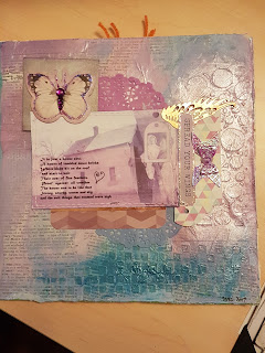
I printed out a digital postcard I created for a swap some 15 yrs ago . The verse was from a poem I wrote when I was about 12yrs old, so you can see I have been obsessed with the theme for a long time. As I had very little ink left in my printer the card printed in very muted colours so I used paint colours to blend in with it. I covered my page in old dictionary pages. I used impasto through 3 different stencils to create texture in the background, then painted over it leaving the word house from the dictionary page exposed. I used pink, pale blue, grey, and turquoise paint. I then used a little bit of Inka Gold in silver and lilac to enhance it. I layed down a couple of small doilies and some paper embellishments behind the postcard and off centered it as the focus of the page.
My two page spread was a row of little paper pieced houses. I used watercolour for the sky and acrylic paint for the grass. I stenciled over the grass with two colours using a stencil from China.
I use Tim Holtz washi tape for a dividing border. This page was inspired by a previous spread I had done in another of my journals which in turn had been inspired by a spread done by Lynne Gray at a crafting weekend we attended in March. I did not like how this one turned out as much as I liked my originally one but it was done. I am looking forward to seeing what the other artists in this round create in my journal.
An evolving group of Australian Artists working collaboratively in our travelling art journals. If you would like to join us please apply to join The Australian Art Swap Group on Facebook.We are a friendly and active art swap group who do a lot more than just art journals.


Great Journal Joan,love the theme :)
ReplyDeleteLooks great Joan. You have done a lot of good work there.
ReplyDeleteLooks lovely! Really looking forward to working in this one and am inspired with a few more ideas from your pages.
ReplyDeleteIt's a lovely journal Joan, hope I can do it justice! xx
ReplyDeletevery Joan, but also not very Joan. I expected more abstraction but at the same time I love the direction you chose - I'm sorry I won't be seeing it in REAL life.
ReplyDeleteOh I love your page Joan and its a wonderful theme. Journal lools great.
ReplyDeleteWow Joan...your journAL LOOKS AWESOME...LOVE WHAT YOU HAVE DONE.
ReplyDelete