Showing posts with label Homage to Art. Show all posts

Friday, May 25, 2018

Homage to Pro Hart

by Jenny James for Lisa Jones

Pro Hart was an incredible talented artist from the remote town of Broken Hill, New South Wales. His life's work includes beautiful brolgas, cricket matches, horse racing and never to be forgotten adverts for carpets.

For those of you who missed out... Pro Hart used to take a huge amount of food and throw it around on a brand new clean carpet. "Painting" a dragonfly! The cleaning lady used to enter the room and say "oh Mr Hart!" before cleaning the carpet, making it look brand new again. I think it was advertising Scotch-Guard or a special kind of carpet. I think it was LeCornu Carpets but could easily have been someone else! This is his family's website ... https://www.prohart.com.au/biography

My homage to this amazing artist started with wandering around his website and googling for pictures because our books show only the silver mines and cricket matches. I was originally going to do something with the brolgas but the kangaroo (or dog, thanks Annabelle) caught my eye.

I used the smooth and creamy Jane Davenport acrylic paints and painted the basic areas of the painting.

Thinking Outloud...
In hindsight, I should have used artists' paint because now I know the real difference. It isn't just the quality or quantity of pigments, the brand or even the price. Artists or professional paints don't change colour as they dry and the acrylics don't have a mind of their own, blending with each other at their own accord. Mind you, Dylusions paint, while it dries slightly different colour to the wet paint, doesn't seem to blend as much as what Jane's paint did.

You know, it could easily be just my technique - the wannabe professional fulltime artist! lol :) The Egyptian painting didn't behave like this and neither did the Cheshire Cat, so maybe its because I was trying to emulate Pro's strong abstract style of bold lines and strong contrast - I should have used a binder or medium as I painted or at least over each layer. Colour shift I can work through when I know its going to happen, and only matters if I'm trying to match something else.

Of course now I have a real excuse, I mean reason, to order in the Winsor & Newton professional paints that I've always wanted...! lol :) I'd buy Jo Sonja if I could but they're as rare as hens' teeth. Except that has to be pushed back again because Miranda has just released a new collection of stamps and stencils... see you in a minute, off to fertilise that money tree!

Homage to Pro Hart, finished painting. Acrylic on paper.
I didn't take any step by steps... but here's how the painting came about... using browns and greens I added the bushes and gave the trees leaves. Next I painted the trees at the front, the middle tree then the twisted tree.

I added a wash of yellow to the ground and green into the shadows. The main fence was painted with a back and forth mix of sandy-creamy-offwhite and dark brown. The dog and roo was next, then the blokes (I love how they still look like people yet have no details as such), finished the trees and added black to selected areas like the dog, roo, blokes and trees.

Mum walked in at this point and I told her about the colours misbehaving - so after a discussion on why she uses fixative so much, I got out the matte medium and added it to the paint for highlights (white and green) on the trees, leaves and the little fence at the back. And added more red sand under the bushes and in the shadows, and finally, fixed that mess of a tree - again. lol :)

But all in all, it turned out ok! I really did enjoy myself cos I love love love painting! Even with the paints having a life of their own :) lol :)

Thanks to everyone who commented in FB and said how wonderful it looked. Lisa has it now and still loves it even after seeing it in real life, so I'm thrilled :D Love a happy ending!

Thanks so much Lisa! xx

Saturday, February 17, 2018

My Journal Recap - Homage to Art!

I was so happy to get my Round 4 Journal home last weekend, compliments of Joan!  We're so lucky that we both live in Melbourne (well I do, Joan is a bit further south!) and get together with the Art Mesaj Group once a month on a Sunday to mess around in art journals.  Any other Melbournians are welcome to join us!

Anyhoo, back to my journal.  It's about A5 size, and my instructions read "This journal is about admiring other people's art and wanting to try and emulate it yourself.  Imitation is known as the most sincere form of flattery, and so long as you credit the original artist, it's a wonderful homage to their art!"

My front cover is in the style of Roben-Marie Smith , a wonderful mixed-media artist.  Roben also has a great Facebook group called Claim Your Happy that you should definitely check out.

My inside cover comprises my contract, some texture-paste flowers in the style of  Toni Burt - I adore her gorgeous faces with flowers, and my title page a lรก Julie Fei-Fan Balzer.  Julie introduced me to art journalling about 4 years ago, and I love her use of bold colours, stamps and stencils.  

My first entry was from Jan, and is based on the gorgeous metallic art of Gustav Klimt , coupled with the flowing trees and backgrounds of Sue Davis.  I love the colours and composition!


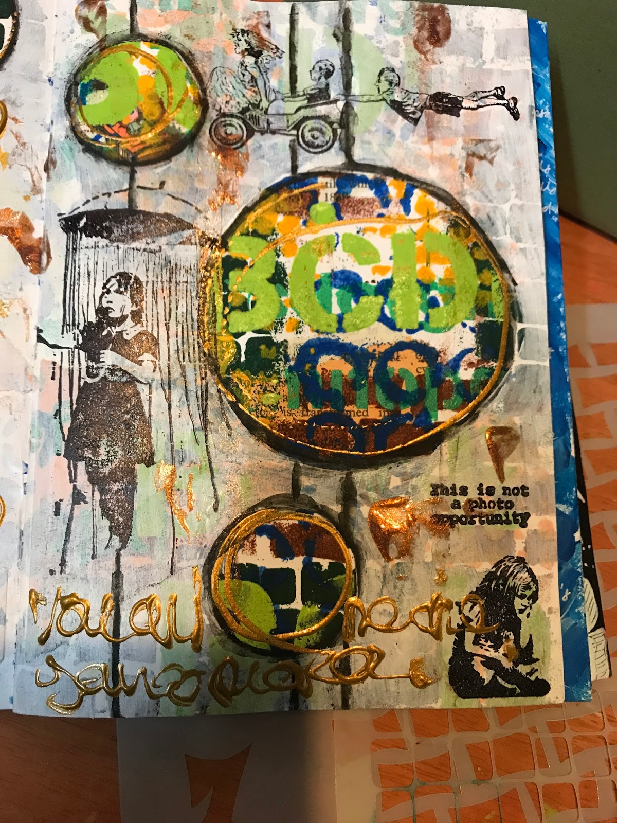
Next page in my journal is by Lesley and features the iconic Banksy. Thought provoking, modern street art that is amazing!  Lesley's page is grungy with heaps of Banksy stamps, and I love it!


Next up is Pam's entry, based on the healing art of Bebe Butler and the backgrounds of Traci Bunkers.  Gorgeous colours and textures here, and Pam added a lovely paper flower too.


Next is my entry - my take on Starry Night by Vincent Van Gogh.  I've admired his work for a long time; such passion in the brush strokes!  I also discovered that Vincent wrote to his brother Theo often, and the letters are beautifully written.  Definitely worth checking out!


The we have Colleen's bright page paying homage to Dyan Reavely.  Dyan's art is fresh and quirky and her Dylusions products amazing!  I particularly love the Dylusions journals and paints, but have yet to try the sprays!  Colleen's page is just delightful. 


Joan chose Ken Done as her inspiration.  His Australian art is bright and certainly iconic!  Joan has done two different pieces; the one on the left is called Collection, but not sure of the gorgeous parrot on the right.  Love the colours Joan!


And that was the extent of my guest journalists since Joanna didn't get a chance to do a page!  At the back of the journal is my sign in page, based on a Rothko print.  His simple colour blocks really appeal to me.  Next to that are my doodles based on Cherie Bitanga's gorgeous art doodles.  Cherie used to contribute to the 52 Week Illustration Facebook Challenge that I was part of, before she became famous. ๐Ÿ˜€  The quote is by Adam J Kurtz, who I follow on Instagram.  His posts are funny and real, and well, just  make you feel better.  ๐Ÿ’—


My journal also has a flap that goes over the front cover.  The front part is heaps of flowers done in the style of Alisa Burke.  Alisa does beautiful vibrant art with a lot of flowers.  The inside flap is a girl done Penny Stamper style.  Penny Stamper is Angela Kennedy, and she draws beautiful but often sad girls that I love!


My rear cover is based on a Dina Wakley silhouette.  Her art is messy and colourful and I love it!  I have Dina's book Art Journal Courage which is fab.

And that's my journal!  Thanks so much to all the lovelies that contributed to it - and next week it goes off to Jenny so she can add something too!

Looking forward to the next round!   ๐Ÿ’œ๐Ÿ’›


Friday, August 11, 2017

Jan makes a Homage to Art

Jan makes a Homage to Art in Lisa Jones Journal

I decided I wanted to do a page that paid homage to Gustav Klimt. I have a lovely book about him and his art and it has wonderful full colour plates. So plenty of inspiration. I am amazed when i look closely to his art that he was so adept at mark making. He could really teach us modern artists a thing or two. Here is a close up of one of his pictures. Awesome.


I was also inspired by Sue Davis, a wonderful American artist. I love how she gets her backgrounds, so I used this for the base of my page.

Then I created my tree and went to work. I did a bit of stenciling and doodling to tie things together.
Hope you like it Lisa.


Saturday, July 22, 2017

Lesley's Homage to Art

LESLEY ALEXANDER'S PAGE IN LISA JONES'S ART JOURNAL..JULY 2017.
I was excited to be the first person to paint in Lisa's art Journal. The theme of Lisa's Journal is Homage to art.The artist I decided to pay homage to was BANKSY even though it is not really known who BANKSY actually is ( there are a lot of suspicions ) he is quite famous for his street art.

I started my page with some torn papers..

followed by the use of lots of stencils and acrylic paints to randomly fill the page.


I then drew my circles and gave the rest of the page a light covering of white gesso, I used gesso instead of white paint because I wanted it to be more translucent .


I then used my favorite BANKSY stamps to fill the rest of the page.


  1.   
  • I also decided I would do a matching tag for each page that I do as an extra for the owners of each journal for them to use some other way .

  • Thank you Lisa for sharing your awesome with us.

Tuesday, June 20, 2017

New Journal - Homage to Art

For this next journal swap, I decided on the theme of 'Homage to Art'.  We all admire other people's art and often try to emulate it in our style.  Imitation is the sincerest form of flattery!  So I'd like the peeps who work in my journal to pick an artist, blogger, or piece of art that they admire, and have a go at doing a page!

My journal is around A5 size, and adapted from a Teesha Moore tutorial.  For my cover, I've done a page in the style of Roben-Marie Smith, using some word tiles I found at Typo.


My back cover is a Dina Wakely.  Love using these bright colours!


I also have a flap that goes goes over the front, and have done this bit with some help from Alisa Burke.


My inside front cover has the copy of the contract, and some textured flowers a la Toni Burt.


My front page with the intro and instructions, is based on Julie Fei-Fan Balzer's journals.


At the back, I have a journal sign in page painted like Mark Rothko.  If you don't know his work, Google him - very simple but effective pieces, that sell for squillions!


The inside back cover is based on some doodles by Cherie Bitanga from The Jar of Salt - I love her work!  Plus I found a great quote by Adam J Kurtz to include.


And the inside of my flap is based on the girls that Angela Kennedy does (Penny Stamper).  I love her style!


Geez it looks like I went overboard doing all these pages, but I wanted to try so many different artists!  Lastly, I did a journal page based on Vincent Van Gogh's Starry Night.  I went and saw his exhibition at NGV recently, and though sadly this painting wasn't there, I've always admired it, and love his free style of painting.  This page has a flap, so I've included the lyrics from Don McLean's song "Starry Starry Night" and on the inside flap, part of a letter that Vincent wrote to his brother Theo, in September 1899.  


I really enjoyed setting this journal up, and look forward to what the other participants decide to try.  It's great for your art to get out of your comfort zone and try new things, so embrace it!

Cheers, Lisa x