Tuesday, April 28, 2020

Flight of the Hobgoblin

I found this most awesome stamp set by Pink Ink Designs a while ago, perfect for Louise's whimsical theme. A flying hobgoblin with a bee, leaves and a shoe... goes perfectly with my fave Dylusions stamps and stencils!

The page began as black and green plain paper, good for a night day page. After applying a few assorted patterns though stencils with ink, I added some collage crackle medium... who knows what I was thinking! Sort of turned out ok, much better the next day.

Stamps were coloured, trimmed and stuck down with glue... then everyone's eyes redrawn so they looked in the direction I wanted. The quote is a Tim Holtz stamp :)

There's a fine line between genius and crazy!

Its ended up to look like an interesting page, hope it makes you smile!

Happy creative day to you!


Tuesday, April 21, 2020

Back to the Future


Deb's Memorable Movies Journal.
Back to the Future is definitely my most favourite Memorable Movie.
I love everything about this movie. I decided to create a pop culture poster journal page.


I started by covering the page with blue and purple acrylic paint. I then dry brushed white acrylic over the top. I was aiming for a washed out, almost space looking background.

Then i used black acrylic paint through some cool cog and clock stencils. 
I added some arrows as they reminded me of the Title of the movie, and the movement of time.

I then decided i would wash out the background with white dry brush. 

I then added these really cool designs i found in an old tattoo magazine. I really love how all movie buffs will notice this is clearly Back to the Future, with out clearly writing it on the page. I also used a quote from the movie, personally i think the coolest quote ever. 
Thanks for viewing this, i had a ball creating it. 

Thursday, April 16, 2020

Jenny's art critic paper dolls

I had any idea to do a little less serious but a little more positive page, mostly inspired by my parents who are very critical of anything less than traditional art.  I did start out with what I hoped would be a faux marble wall with a wood wainscotung emulating an art museum, i failed miserably but fixed it as best i could, not totally unhappy with the result.  I then stamped and framed some quirky faces.  I colourised some Tim Holtz figures of two ladies who were cast as my critics and made a little bench for them to sit upon.  Finally stamped the words above their heads, 'ere Ethel the things that pass for art these days.  And then as the main title create YOUR art.  As a reminder we need to create for ourselves and how we feel we need too, it's ours, and we need to be proud of that no matter what others may think. 

Tuesday, April 14, 2020

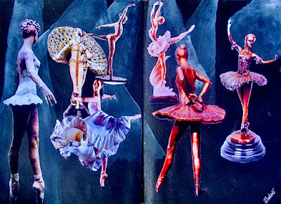
Ballet Studies


In Melissa Guest's Ballet Journal I, Janie O'Brien,  created a series of ballet studies under spotlight. I found a number of illustrations on Pinterest for this piece. I resized them appropriately, printed them out on matt photo paper, then fussy cut them out. The background was painted matt black, and the spotlights were painted in with with a wash of diluted white gouache. 

Friday, April 10, 2020

Feeling Comfortably Numb in Wendy's Music Journal

by Lisa for Wendy

I love music.  I love singing.  I do it often in the car, where no one else can hear me.  Unfortunately I'm shite.... 

But anyway.  When Wendy announced that her journal theme was Inspiring Music, I thought yes!  I have so many favourite songs, or pieces of songs, or lyrics.  It was actually a bit challenging deciding on which song to focus on.

In the end I decided on Pink Floyd's Comfortably Numb.  This song was released in 1979 as part of The Wall album, and what a masterpiece this album was.  I think I first heard it when I was about 16.  I love music with a story, and this whole album is a story, about a musician called Pink and his struggles with depression and drugs. 


In Comfortably Numb, Pink is drugged out and holed up in his hotel room.  His entourage breaks in and gives him more drugs so that he can get on stage and perform - the show must go on.  During this time, he's thinking of his childhood during WW2.  

This all sounds really depressing and dreary, but it's a beautiful song with haunting music, amazing guitar solos, and great lyrics.  You can check it out on YouTube here

So back to my spread!  The lyrics I've chosen to highlight are about a boy, who I've drawn with 2B & 6B pencils on tan Strathmore paper.  I love vintage papers and have heaps of Kaisercraft  scrapbooking paper, so just collaged my favourite bits.  


On the right, more Kaisercraft papers plus some old music paper I found.  I printed out the lyrics using a typewriter font - and then thought, why didn't I just use my typewriter???  This was on white paper, so I steeped a teabag and gave it a tea wash.  Matched perfectly!  Plus I kept the teabag to use in my teabag art at some stage. 😊


So, once I worked out what I wanted to achieve this came together quite quickly.  And I'm really pleased with it.  And thanks Wendy, for making an A5 journal (as I have too) - they're so easy to work in! 💜


Hope you like it Wendy!  I hope that everyone is coping okay with this Covid-19 situation and restrictions.  I'm still working, so am thankful of the Easter break.  Happy Easter everyone, and Happy Arting! 💙🐰🐣

Cheers, Lisa xx


Thursday, April 9, 2020

Louise's Gypsy Soul


I certainly have a gypsy soul so playing in your journal Rebecca-lee is an absolute joy. 


Im not feeling that good so thought  I best work this journal early in the month so I can get it finished and leve it so any nasties can die out before it goes travelling.


I drew a mandala, coloured it with inktense and inked it with black gel pen. Did some stencilling for the back ground and then some journaling.


It was a bit too busy so I pushed it back with an indigo wash.


Wednesday, April 8, 2020

Australia journal spread for Janie. Created by Sass Hammant

Well I had a vision, it came together, but really with not too much effort from me... sorry Janie, however I do like how it turned out... I did an awful lot of fussy cutting. I was going to paint the background but when I seen these papers from Meegan Sullivan I thought it was perfect... so I used one of her papers for the background and then started to collage. I didn't take many progress pics, I actually forgot to...


This is the finished layout...


I put the background down and then just started to collage.


I drew a dot / dash border, and added the gems to represent bubbles. Then I started to outline everything on the page with a fine black liner...


Adding the name of the spread and it was done...

I really hope you like what I have created for you Janie, the ocean is my life, love everything about it.. I find it very soothing to my soul... Cheers Sass.


Tuesday, April 7, 2020

Bohemian Beauty

This is my layout in Sass Hammants Bohemian Floral Journal Hope you like it Sass do you recognise the lovely lady, I painted background created flowers photo lace then fussy cut them and glued to the page  xxxx

Friday, April 3, 2020

Paperdolls for Jenny James.

I'm not really sure why it is but I get quite nervous about working in Jenny's journal, maybe it's because she is the only member of the group I know personally and I want it to go perfectly and it never does.

I'm usually full of ideas but not this time. So I thought I'd start with a background of ink in Jenny's favourite colour - green.


Then I had a play with some acrylic paint and did a few flowers but still no plan.


And then I found this lovely butterfly in my stash. 


Jenny has very kindly included some Tim Holtz paperdolls with her journal but I chose this lovely couple from my collection of Tim Holtz dolls. 


Decided it needed a boarder and a few words which I cut from an old calender. A few dots and doodles and it was all done. 


Thursday, April 2, 2020

Wendy Hanna's Inspirational Music Journal

I have many musical inspirations and idols such as Prince, Jimi Hendrix, Janis Joplin, The Carpenters, Metallica, Madonna, Pearl Jam, the Irish band 'The Fureys' etc.... but at the moment I cannot get enough of a young and up and coming artist by the name of Billie Eilish. In her ballads she has a voice of an angel, the music that accompanies her sounds so beautiful, they are also written and played by her brother Finneas, together they make an awesome team. Her other songs, besides her ballads are thought provoking and musically tantalizing. In Wendy's journal I used acrylic paints to illustrate an ocean. Her song called 'Ocean Eyes' is so aesthetically pleasing to the ears that I find myself swaying and drifting, perfect for relaxing and releasing. Wendy I hope you like my contribution, I really enjoyed working in your lovely journal very much, sincerely Melissa xx


I used a canvas paper pad, (pre gesso'd) as the background for both the ocean I painted and the picture I downloaded and cut out of Billie Eilish (from another artist, acknowledged on the illustration itself), I saved it from a free site called pixabay. I used a green fluro acrylic paint to colour her jumper, Billie has been seen wearing fluro colours often when spotted by paparazzi. Her face, the Tarantula, baby spiders, the crown on her head and her necklaces were already coloured in. On the opposite page I stamped a pair of eyes on the ocean painting to represent her song 'Ocean Eyes', this stamp is made by Jane Davenport art supplies. The two brands of acrylic paints I used were by Jane Davenport and Ceramcoat. I superimposed the verses and chorus' of the song by printing it on tracing paper; so that the picture of the ocean could still be transparent. I hope it looks alright, I had so much fun creating this, thank you for this fun opportunity Wendy, Melissa ❤