Wednesday, May 30, 2018

Colleen's page in Walk like an Egyptian

Annabelle's journal is just gorgeous, with a beautiful textured cover. 
I decided to do my pages on the everyday life in Egypt as I had some really nice collage material for it. I started with a painted background.


Then added my collage pieces

Added some grasses with paint pens & stamping & then outlined the building & tree trunks. 


Hope you like it Annabelle.

Monday, May 28, 2018

Stuff 'N Nonsense!! with Pam.

The merry month of May brought Jenny James" very colourful Art Journal to my door.  OMG!!  Whatever was I to do?

I had signed up for a sketch class and one of the tutors introduced robots and I thought there's a bit of nonsense.  So I had an idea,  but no idea how to run with it. Suddenly a totally nonsense song from the 70's popped into my head and I was off with my Ball Bearing Bird.

I took some advice from Jenny's intro and sprayed and splotched and had a wonderful time with my background.  I printed off my robots and coloured them....I was on a roll.  I laid them out to see how they looked....AND...I hated it!!


Now what?  I tossed up all sorts of ideas including gluing the pages together to make them disappear and finally decided a full cover up was needed.  So I grabbed the Payne's Grey and goodbye sprays.


Printed out the words and a little stamping and I called it done.  I hope you like it Jenny.  Here are close ups.


Friday, May 25, 2018

Homage to Pro Hart

by Jenny James for Lisa Jones

Pro Hart was an incredible talented artist from the remote town of Broken Hill, New South Wales. His life's work includes beautiful brolgas, cricket matches, horse racing and never to be forgotten adverts for carpets.

For those of you who missed out... Pro Hart used to take a huge amount of food and throw it around on a brand new clean carpet. "Painting" a dragonfly! The cleaning lady used to enter the room and say "oh Mr Hart!" before cleaning the carpet, making it look brand new again. I think it was advertising Scotch-Guard or a special kind of carpet. I think it was LeCornu Carpets but could easily have been someone else! This is his family's website ... https://www.prohart.com.au/biography

My homage to this amazing artist started with wandering around his website and googling for pictures because our books show only the silver mines and cricket matches. I was originally going to do something with the brolgas but the kangaroo (or dog, thanks Annabelle) caught my eye.

I used the smooth and creamy Jane Davenport acrylic paints and painted the basic areas of the painting.

Thinking Outloud...
In hindsight, I should have used artists' paint because now I know the real difference. It isn't just the quality or quantity of pigments, the brand or even the price. Artists or professional paints don't change colour as they dry and the acrylics don't have a mind of their own, blending with each other at their own accord. Mind you, Dylusions paint, while it dries slightly different colour to the wet paint, doesn't seem to blend as much as what Jane's paint did.

You know, it could easily be just my technique - the wannabe professional fulltime artist! lol :) The Egyptian painting didn't behave like this and neither did the Cheshire Cat, so maybe its because I was trying to emulate Pro's strong abstract style of bold lines and strong contrast - I should have used a binder or medium as I painted or at least over each layer. Colour shift I can work through when I know its going to happen, and only matters if I'm trying to match something else.

Of course now I have a real excuse, I mean reason, to order in the Winsor & Newton professional paints that I've always wanted...! lol :) I'd buy Jo Sonja if I could but they're as rare as hens' teeth. Except that has to be pushed back again because Miranda has just released a new collection of stamps and stencils... see you in a minute, off to fertilise that money tree!

Homage to Pro Hart, finished painting. Acrylic on paper.
I didn't take any step by steps... but here's how the painting came about... using browns and greens I added the bushes and gave the trees leaves. Next I painted the trees at the front, the middle tree then the twisted tree.

I added a wash of yellow to the ground and green into the shadows. The main fence was painted with a back and forth mix of sandy-creamy-offwhite and dark brown. The dog and roo was next, then the blokes (I love how they still look like people yet have no details as such), finished the trees and added black to selected areas like the dog, roo, blokes and trees.

Mum walked in at this point and I told her about the colours misbehaving - so after a discussion on why she uses fixative so much, I got out the matte medium and added it to the paint for highlights (white and green) on the trees, leaves and the little fence at the back. And added more red sand under the bushes and in the shadows, and finally, fixed that mess of a tree - again. lol :)

But all in all, it turned out ok! I really did enjoy myself cos I love love love painting! Even with the paints having a life of their own :) lol :)

Thanks to everyone who commented in FB and said how wonderful it looked. Lisa has it now and still loves it even after seeing it in real life, so I'm thrilled :D Love a happy ending!

Thanks so much Lisa! xx

Lisa playing in Pam's "Words of Wisdom"

Ooh, I love receiving a new journal in the mail!  There's just something about the anticipation of opening a package, and then seeing the journal IRL (in real life, for those who aren't up with their acronyms...!).  The delight to see a package sitting on the kitchen bench when I get home from work.  Ooh!  Mail for me!  Ooh!  Someone actually emptied the letter box!

But I digress...

Pam's journal is an A4 affair with lovely Stonehenge paper.  Really need to get me some of that!  

Words of Wisdom.  Could really be anything, couldn't it?  Don't run with scissors.  Wipe your fridge with vanilla to keep it fresh.  An apple a day keeps the doctor away.   Don't get your meat where you get your bread (which I think means, don't sleep with someone from work!)

I trolled through Pinterest and found a saying that I liked, and meant something to me:

May your clothes be comfy, may your coffee be strong, and your Monday be short.

Yaaas!  I suffer from Mondayitis and definitely need a coffee first thing in the morning.  Happy with this addiction.

Anyway, to my page! 

Here's a little snippet. 


I decided on a mixed media page, and started out with teabags laid down with matte gel medium to make my coffee table.  The remainder of the page I painted with black Dylusions paint.


Next I got out my trusty black pens and drew some lines on the teabags to make it look more like timber.  Quite like how it turned out!  The different teabag colours really resemble timber. 😊


Next I cut a round circle from watercolour paper and drew my cappuccino with water-soluble pencil.  This way I wouldn't need to worry about erasing lines when I watercoloured; the pencil blends really well.   The cuppa was then watercoloured.


Once finished, I glued it in using matte gel medium, and added a teaspoon (again cut from watercolour paper).  Added an edge to the table, a bit of shadow, and voila!  

To finish off I added my quote, stamping with white gesso.


Hope you like it Pam!  I enjoyed the process.  💜

Cheers, Lisa


Monday, May 21, 2018

Janie's Art Nouveau piece, adapted from an Erté design of the period, in Roz's journal.

I painted on 2 coats of Atelier Gold Paint, then sprayed some darker gold Lindy's spray through a mesh, for a bit of texture. I then placed my pre-prepared piece of art work on the page and stuck it down
My next move was to repaint the red with Dr PH Martins liquid acrylic ink (super product - very dense colours) At this point, I also started adding glitter to the fall on the head dress.

Half of the glitter is now applied - quite a long process and my thumb started getting numb from squeezing the glitter, glue bottle.

Pretty well finished. The collage pieces of stylized peacock feathers were added, Lindy's Moonshadow mist spray were added to the head dress and garment (painted on, not sprayed). and curly whirlies added in gold added with a 3D pinhead applicator.


Friday, May 18, 2018

The Cheshire Cat

I've always loved Alice in Wonderland so painting something with this fabulous theme was absolutely awesome. I loved every moment, even when it wasn't going so well (I messed up the background and started again). Thanks for choosing this theme Deborah, its been a good boost to the ego cos he's turned out to be a bit magical looking! So happy... I'm grinning like he does! lol :) Hope you like him too!

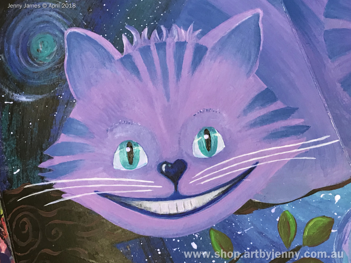
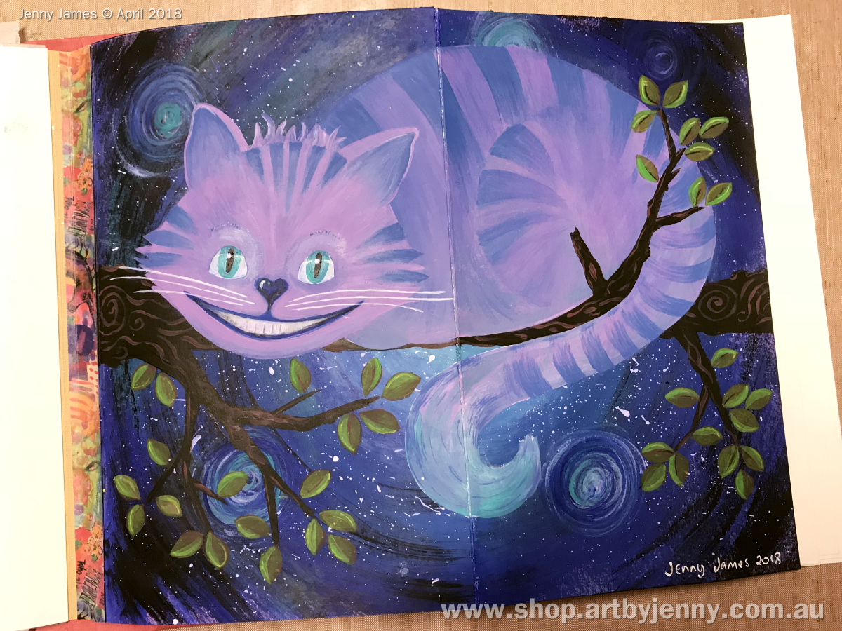
above : the one, the only, the amazing... Cheshire Cat!
Portrait version of the finished happy cat... I used only a few treasures : Dylusions acrylic paint, Jane Davenport Gesso, paint brushes, a watercolour pencil for sketching out the cat after painting the background and coloured pencils for deciding upon the colour scheme.

I was going to add a quote but forgot all about it after I started the actual painting! I remembered after I sent the book to Sharon. It was going to say either “If you don't know where you want to go, then it doesn't matter which path you take.” or “I am not crazy, my reality is just different from yours.” or “which way, that way, here, there, anywhere” (with arrows).

Scribbling out thoughts, deciding upon design, characters and choosing colours. So many fantastic characters from these books that are fun to portray in art!

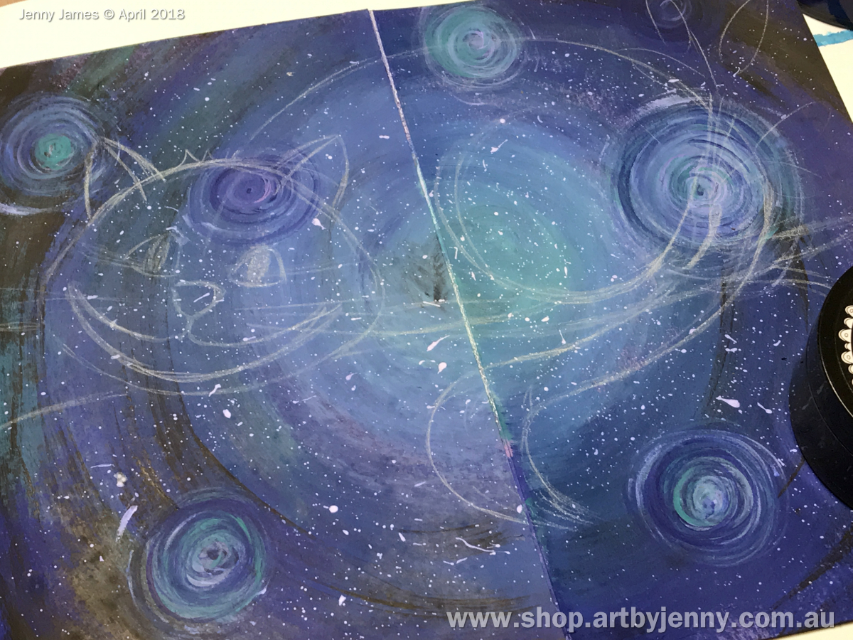
The final design is based upon the original sketch of the Cheshire Cat by John Tenneil when he (CC) was telling Alice the best way to go.

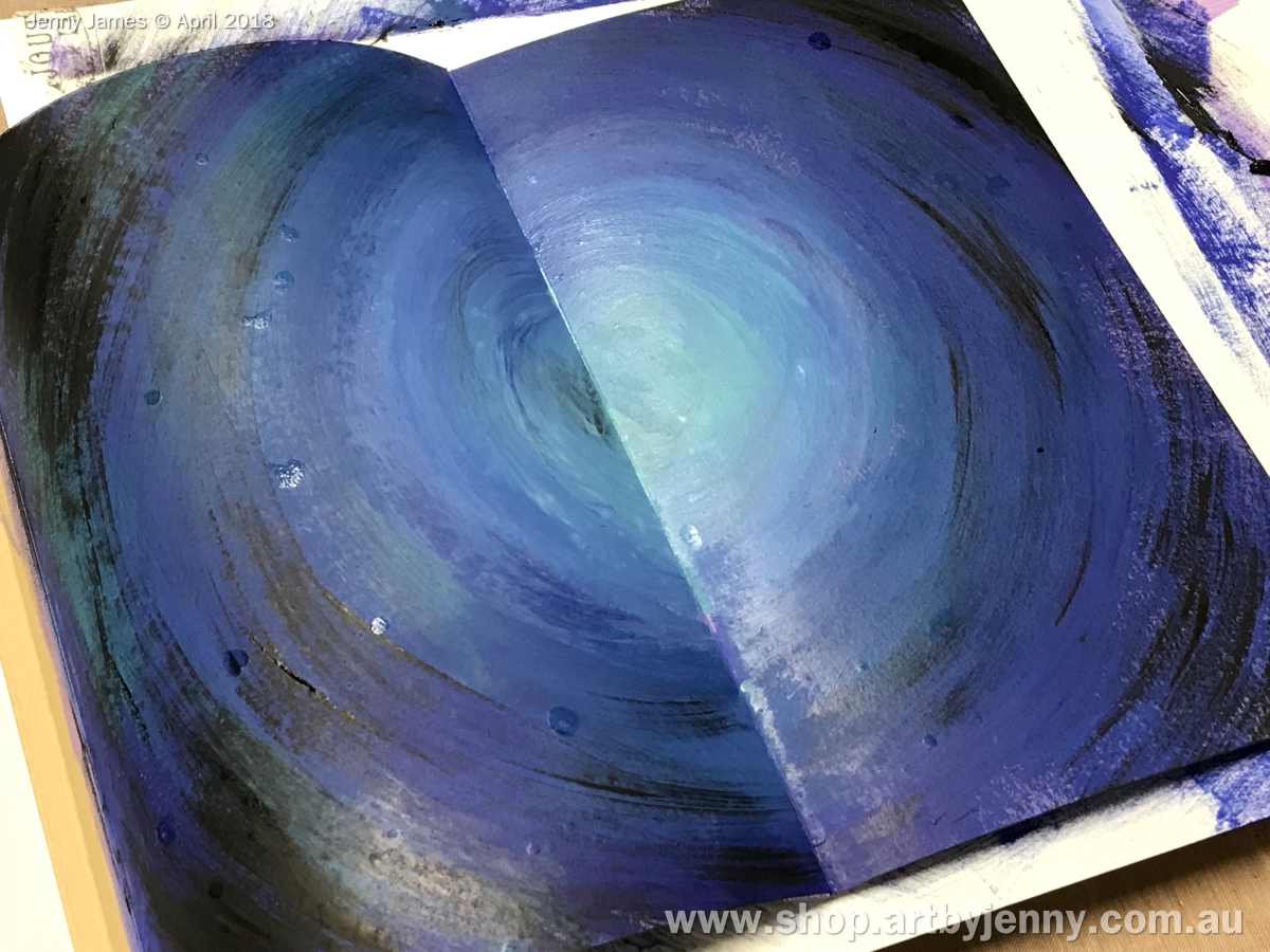
Round and round and round I went with the paintbrush ... Dylusions paint in After Midnight (dark blue), Laidback Lilac (pretty purple), Vibrant Turquoise and Black Marble.

Adding white splatters of paint is much easier using a splatter brush than the old toothbrush! But then spilt some paint so turned that into a spiral. Next thing I knew, I had all these spirals over the page...

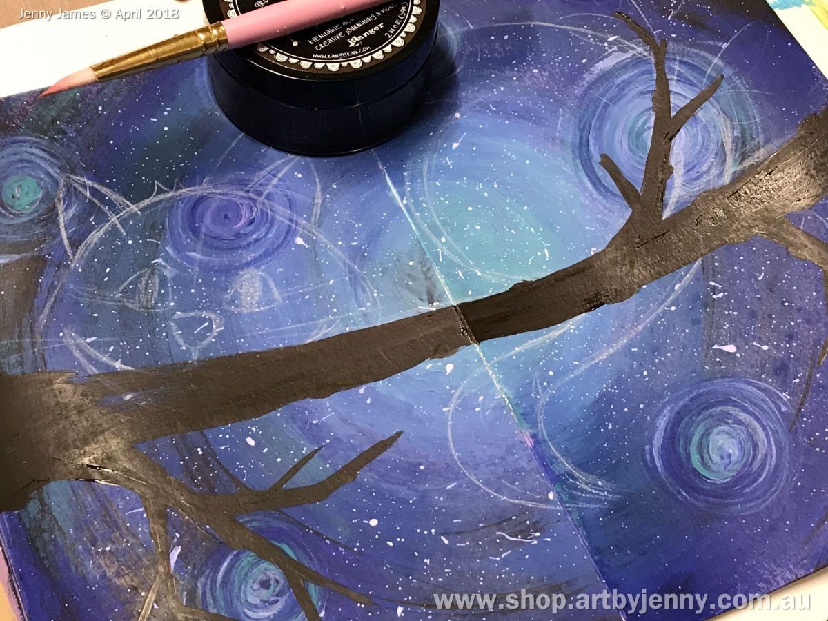
I drew the Cheshire Cat's basic shape and a rough tree branch in watercolour pencil after the background had dried properly.

Ground Coffee tree branch decorated with Melted Chocolate swirls... sounds delicious!

Quite a nice combo, the two browns. Pre-mixed colours make life easy :) I love mixing colours, even just adding a smooch of white or spot of black to anything makes me smile...


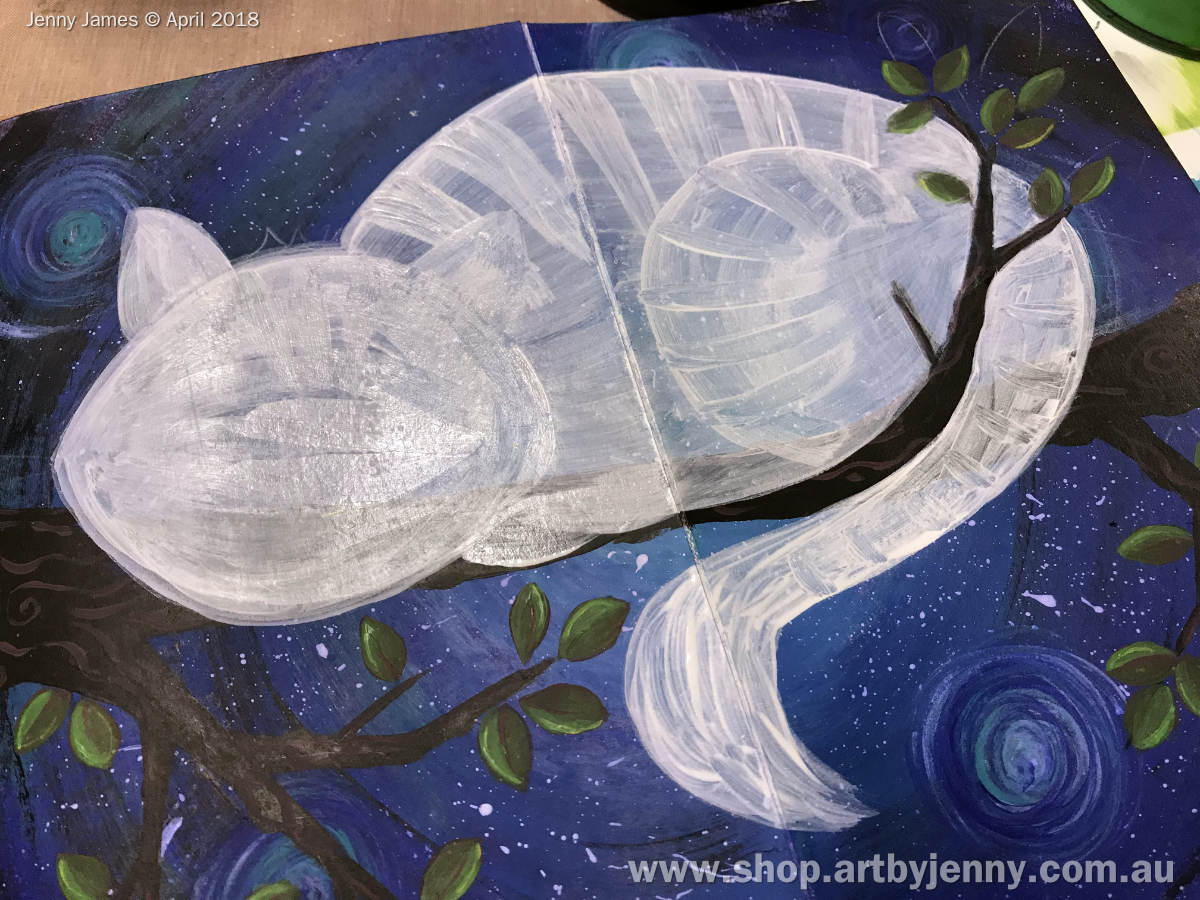
The leaves were painted in layers, one colour at a time ... first I used Melted Chocolate, then Dirty Martini (yummy earthy green, my fave). With this paint, the colours underneath show through adding a bit of depth.
Next I added a line of Lemon Zest (yellow) along one side of each leaf then waited for them to dry before painting over it with Cut Grass (bright green). then a line down the centre with the brown.

Next was the cat himself... I painted his basic shape in Jane Davenport's white gesso. Its not as thick as some, its more like the Liquitex gesso - smooth and creamy. Anyway, I painted his stripes and features a few times to get the shape and stripes looking how I wanted.

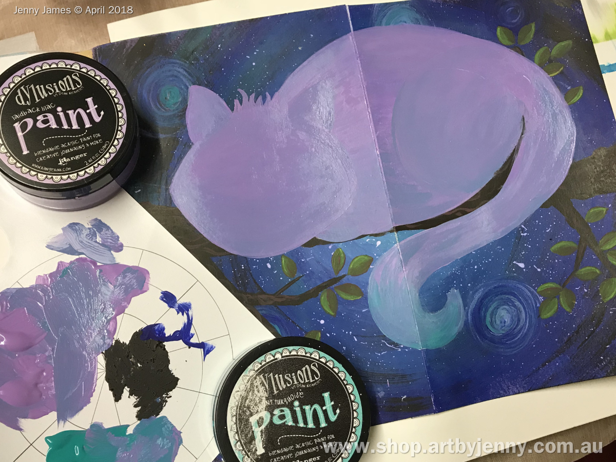
Once the white shape was ingrained into my head (don't ask), I mixed up some Laidback Lilac and Vibrant Turquoise to get a blue-purple mixture. I painted the Cheshire Cat in the purple and blue, then where the colours met, blended it with the new mix.
I should mention that I don't clean the paint brush inbetween the purple and blue... which why having a palette is so important - it keeps your pots of paint clean :)

Don't forget, if you use pots of acrylic paint like Dylusions (and live in warm dry climates like Australia), to add a spritz / mist of water into the pot before closing the lid. This puts back any moisture that evaporated while the lid was off. I didn't do this with my black and it looks like black cottage cheese! lol Still works :)

The Vibrant Turquoise and White Linen makes it look mystical and magical :) So pleased with how its turned out.

A splash of white, dash of black, smoosh of turquoise and he's a completed cat.

Oh, and it has a strip of Jane Davenport Washi Tape down the edge because I made a mess :) lol

Hope you like him Deborah!

Thanks so much for reading this blog post :) Hope my Cheshire Cat inspires you to get arty and crafty!

Happy Creative Day!
:D
Jenny

Monday, May 14, 2018

The Rogers Vintage Circus!!!


This is my page I did in Sharon Rogers Vintage Circus Journal you might recognise the circus performers if you look closely.

 I had fun doing it
 hope you like it Sharon xx

Funky Town


Robyn's cute little journal has been sitting on my desk just waiting for me to play.

I have been trying to remember what I dreamed of as a kid and I think it was living in a real community. 

My Mama had a really cool friend who homeschooled her kids and I had a girlfriend down the road with an exotic hippy extended family. I so wanted to live in that funky imagined utopia.

My page is created using home made stamps, acrylic paints, gel pens and posca paint pens.

Saturday, May 12, 2018

My spread in Pam's Words of Wisdom Journal

First of all I must apologise for being so late with blogging...Life is a bit hard at the moment...and to prove that, I joined the Upside Down Club. Sorry Pam - my spread is the wrong way up!!
I did the background first with gesso and napkins and let that dry. I then added some Pixie Powders and spread them around with diluted PVA. I covered the doubled page spread with cling wrap and let it dry. Next I added some Archival Ink in Orange Blossom...I just rubbed the pad directly over the background.. I had decided on the quote and printed it out on purple paper. I pondered over the purple for about a week!! I had also decided on the Dyan Reavely stencil to do the girl...I traced the outline onto some paper that I had done with napkins,paint and glitter. I also knew that I had  the image of the crayons saved on my pc so I printed them out, coloured them with crayons and cut them out. I added shading with a Distress marker and edged the spread with a red crayon and a black marker.
Hope you like it Pam!!

AAJS6: Sharon's Page in Annabelle's "Walk Like an Egyptian" Journal

Hi Everyone!
 
 
Sharing my spread in Annabelle's journal - fab Egyptian theme!!
Some great pages done already - I bet the finished journal will be amazing by the time it returns home to it's owner!
 
I had so much fun creating the background and colouring the quirky little characters from Vera Lane Studio!
 
For the background I used some greaseproof paper (tissue paper works the same but the greaseproof paper is a bit stronger for adhering it to the background pages.
 
I started by spraying the paper with ink sprays in what I thought were desert and Egyptian jewels colours ie. yellows, browns and nice deep blue and emerald colours.
 
 
Once dry I then used impasto/matt medium to adhere the sprayed paper to the pages - I smoothed them out but any added wrinkles and imperfections I was happy with to add to the texture and interest of the background.
 
 
I added some stencilling with both gold and metallic emerald all over the pages for some added richness of colour. When you think of the Egyptians you think of richness and lapis lazuli!

 
I printed the Vera Lane Studio images onto white cardstock. I coloured the "head" of the gal with Copics and then used ink sprays to colour the body and also the camels - the effect was just what I wanted for the page. Once the spray was dry I fussy cut all the images ready to add to the background.


I printed some "border" Egyptian themed graphics for the top and bottom of each page and I also found the lyrics to the song that kept going through my head the whole time I was working on this page "Walk Like an Egyptian" by The Bangles! I tore the wording out and added to the pages along with some bits of muslin cloth - which makes me think of "embalmed mummys" LOL!!!!
 
 
And here are the finished pages! I hope Annabelle likes them!


I can't wait to see future pages in this journal - everyone interprets themes differently and it makes for a wonderful journal at the end!
 
 
Sharon


Saturday, May 5, 2018

Deb's entry in Louise's Gypsy Journal- April 2018

I'm Late...I'm Late...for a very important date...
But this post isn't about Alice, it's about the gorgeous Gypsy Journal that Louise created. I love how interactive your entry is Louise (and Janie's entry in there as well.) I enjoy doing these journals for our group as I always end up learning something new as I research my ideas for my own entry. I was amazed by the history the Gypsy people have and how far back it goes.
My entry in Louise's journal was about the art of Palmistry. Like the crystal ball, palm reading to tell your future was something mysterious and exciting the Gypsy's did and it intrigued me. I used a mixture of Dylusions paints randomly for the background.On the left page  I traced the outline of my own hand and painted/filled it in with acrylic and highlighted with  Pitt Pens. I then drew some of the symbols and meanings that people interpret when they look at the anatomy of your palm and drew/wrote them in. 

On the right page, I wrote a Romani Proverb using a white POSCA Paint pen. 


This journal is now traveling on its way to the next Gypsy in line. I hope you enjoy this entry and have a great day!