Showing posts with label Monotones. Show all posts

Friday, January 27, 2017

MONOTONES is almost finished


It was a real pleasure to receive my mums travelling art journal- Monotones, and have it in my hands, to touch and look at and then to play in the remaining pages.

I wanted to try and work in the colours not present yet and it was pretty hard because this gorgeous journal already had a rainbow


Monotones is a bit of a challenge for me who is very partial to the entire range of colours and using them quite liberally. I found there was no gold and no red so I went with them. 


The first 2 pages were play and fun and I am also using them as journal prompts in our Australian Art Swap Group and the third one was much more personal.


I recount memories from a long ago family holiday and include some natural elements from that trip.
I have another page in process and am leaving a double page for my beloved mama to play in and then her whole journal is filled!


I did this little one on the back page and I made a video if you want a look through the whole thing. It features many artists work from the Australian Art Journal Swap.


Sunday, October 23, 2016

Lisa J - Working in Pam's Monotone Journal

Pam's Monotone journal is a lovely hand made A4 journal, beautifully covered.  

Her brief was to create a page using only a monochromatic scheme - only one colour, but you can use all of its shades and tints too, plus black and white.

Hmmm.  What colour to do? Purple and pink were already gone, along with teal and blue-green.

I decided to go with blue, since it has lots of variations (and it's one of my favourite colours).  I had lots of blue paint sample cards, so thought I could incorporate them in some way, plus I gelli printed a stack of different blue papers.

I picked a page that had an extra flap on it, just to push myself a bit further, and decided on a little town on the edge of the water.  

The background was simply rolled on with a brayer to create a messy effect, then I built up layers of collaged bits to represent the countryside.  The water was created by adding scrunched up bits of paper tissue with gel medium.  I like the effect, though using matt instead of gloss would have been better.  Oh well.

The houses were then added, with windows and doors drawn in with white Uniball Signo (my favourite white pen!).  The lighthouse completed the page.


I also wanted the same scene to flow to the page underneath, when the flap was opened.  This was a bit of a challenge, getting everything to match up, and flow well!

Underneath I added a castle, again using paint sample cards.  Then, added a couple of quotes that I liked.


Hope you like my interpretation Pam!  I also did another page for you since there was a single page that was blank - but I'll keep that one as a surprise for when you get your journal back... ;)

Cheers, Lisa


Sunday, May 22, 2016

Lee works in "Monochromatic"


inspired by artists I admire
I love the use of see thru plastic and stitching with barely visible words and wanted to try it for myself and love the loneliness of a single person with a long shadow it says so much with such a simple image.

Sunday, April 3, 2016

ROUND 3: Wendy's entry in Pam's MONOTONES

I gave myself rather a hard time doing a page in Pam's journal, mainly because I think I had lost my mojo...pushing myself through it, in the end  I really liked how the double page turned out. I chose my favourite colour tones....yep, purple...lol. I wanted to keep the back ground relatively plain and have the focus on the swirls and then I couldn't decide what to place in the centers. I came up with purple and white tissue flowers with a button in the center. The button is attached with 2 shades of the purple cotton.

There is a border of purple lace and I added some lighter purple flowers in two of the corners.
 The saying on the page says, "Things turn out best for people who make the best out of the way things turn out."
 Full showing of completed layout. Hoping you like it Pam. Thank you.

Monday, February 29, 2016

Working in Pam's Journal "Monotones"

Hi everyone,

Wow, talk about nerves galore when I received my first ever journal to art in that belongs to someone else...and a theme to follow !! Well, she's arrived...I've opened the careful packaging and found the most beautiful handmade journal. The cover is luxurious and the paper is to die for !! Once I opened that journal I just couldn't wait to get started...what a silly waste of emotional energy earlier haha !!

Firstly, Mishmash shared a picture on Facebook of baby owls...haha, the idea started to sprout. I just love baby owls...don't you? Anyway, I thought, I can do a monotone with brown baby owls. The drawing part came pretty smoothly and the coloring was so much fun but I didn't know what I would do with the rest of the page. Luckily, stamping, printed book paper and a poem finished it off. I favoured Derwent Inktense (without activation) pencils, gouache paints, and acrylic and water color paint.

I really hope you enjoy it Pam as much as I did creating it !!

Love Natalie


Sunday, February 7, 2016

Pam's Monochrome Journal.

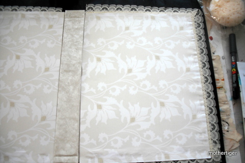
First may I say thanks for having me as a latecomer.  I was gifted a semi-made journal by my lovely daughter Louise, so I have spent some time finishing it off.  I added end papers, stitched the signatures in and lined the edges with lace.  Very feminine  :)

I worked on my Title Page with stencils and paint
and printed off a copy of an earlier piece to illustrate my title.
Then I needed to do my spread.
 I had a hard time deciding which one colour I would use as usually I paint a rainbow.  
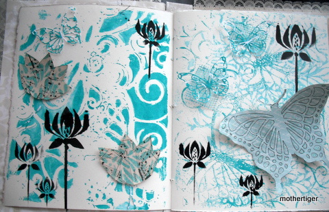
Eventually I settled on a turquoise colour. 
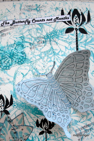
 I wanted lotuses and butterflies.
Finally found a quote I liked and there it is.
Hope you like it and I hope you all enjoy working in it.