Monday, August 31, 2020

Jimi Hendrix, Purple Haze

 Memorable Music Art Journal...

JIMI HENDRIX


I started my covering the page in a light purple acrylic paint. I then used a royal blue arcylic paint through a really cool stencil.


I then used Pink acrylic paint through a similar stencil, however the patterns didn't really show through as much as i wanted. I then used a circular pattern with Orange acrylic paint. 


It was at this point i started listening to Jimi, especially the song Purple Haze. This Amazing song reminded me of relaxing t home when it's rainy outside, so i decided to show this in the page. I love drip art, so fun and messy. I used Finnabair Liquid Acrylic Purple watered down and lindy's squirts Purple for the rain. 


I used a print out of Jimi from a Google search. I was going to attempt to paint him but didn't want to ruin that Strong image.

I created a Purple Haze around Jimi using Sprays, ink and Watered down Acrylic paint. 

I used a very opaque white posted paint to write words that describe Jimi. I came across an Amazing Image taken from The Jimi Hendrix Park Foundation.  This image is of words that Jimi's fans used to describe this Amazing artist.


I borrowed some of these words for my page. 

Interesting fact about Jimi Hendrix.

Funniest Misheard Song Lyrics Ever. Purple Haze.... "excuse me, while i kiss this guy", in stead of the actual Lyrics "excuse me, while i kiss the sky"

Jimi died at the age of 27, his career only lasted 4 years.

Jimi was only known by the name Jimi in 1966, he was born as John Allen. Once his father returned from WW11 he renamed him James Marshall Hendrix. Jimi was first spotted at a cafe where he started playing his Guitar with his teeth. Chas Chandler, the Bassistfor the Animals apparently said "wow, i can do something with this" and suggested to start using the name Jimi to start an amazing career with this unheard of kid. Jimi could not read music and taught himself to by ear. He would often use words and colours to describe what music he wanted to play and what emotions he wanted to portray.

I really enjoyed creating this page in The Memorable Music Journal.

I really loved creating it.


True Colours


Lisa's 80's theme journal is a riot of colour and fun and it took me a while to settle on a theme.


That was a great opportunity to play lots of 80's music and sing my heart out and eventually settle on one of my favourite albums. Even my 17 yo thought some of the music was cool. 

Wednesday, August 26, 2020

My Whimsical Creatures creation in Louise Kirby's Journal - Janie O'Brien


So many creatures travelled through my mind while I was thinking about creating this page for Louise. I moved from absolutely realistic to absolutely abstract and back again, but I knew I wanted colour so I settled on creatures in between realistic and abstract. I hope you enjoy them Louise, I will be sorry to see them go; I really had fun with this. All hand painted with various techniques, apart from the little birds which were a last moment collaged addition - couldn't help myself; they had to be there.


Sunday, August 23, 2020

The Dancer


 This is my spread in Melissa Guest Ballet Journal Hope you like it Melissa painted background added tule fussy cut little roses and ballet shoes kiddie glits roses did a caricture of Melissa as a dancer 

Wednesday, August 12, 2020

Grease is the Word!

 This is my spread in Lisa Jones' Journal the 80s, one of the all time great movies that came out in the 80s the movie itself was set in the 50s Hope you like the cool doods   Lisa xx

Tuesday, August 11, 2020

Flowers for Robyn!

 by Lisa for Robyn

I've got into the habit of not checking which journal is coming to me next - anyone else doing this too?  It makes it nice to get a surprise in the mail!  

So when I received Robyn's Flowers journal it was indeed a nice surprise.  Inspiration came quickly for this, as I'm currently making some sunflowers for a canvas that I'm doing.  I had extra petals left over so thought, yes!  That's what I'll do!

I even remembered to take some progress pics, woo hoo! 😄

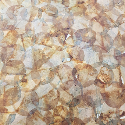
So these petals are made from recycled teabags, that have been dried, emptied, and glued onto either white cartridge paper, or an old school dictionary.  I then watercolour the papers, and cut them out.

For my background, firstly I covered the journal pages with a layer of torn cartridge paper.  Mainly because Robyn's journal is made of signatures, and I wanted the two pages to stay together.

Then I added teabags to the background.  Same method as above, except the empty teabags were cut into circles, and glued directly onto the cartridge paper background.  Overlapping the circles gives a really interesting effect!  

The beauty of gluing teabags is that, because they're porous, you can just plop them down on your page and glue over the top instead of having to glue each piece from the underside.  Genius!  I use matte gel medium for my glue.

After gluing the background, I added a few layers of blue watercolour.  Some colours react better than others, and the colour that you end up with also depends on the type of teabags you've used! 

Next I added the sunflower that I had made.  The centre was cut from another piece of cartridge paper and teabags, then watercoloured, and tea leaves added for texture.

A leaf and stem were also added to the page, created the same way.

My spread was almost done, but I wanted to add some text.  I couldn't find my letter stamps - put them away somewhere during an iso tidy up 😩...  So instead I grabbed a scrap of cartridge paper, ruled it into rectangles, pencilled my letters in, and scribbled them in with a Pitt pen!


After I cut them out, I outlined and smudged them with a water activated pencil.  Easy peasy!

And this is the end result!  I think it's a happy little page, which we really need right now.  High fives to the other Victorians putting up with Stage 4 restrictions, and well done to those living in other states for keeping it at bay - please don't get complacent though! 💜💛


Hope you like this Robyn!  Happy Arting everyone. 

Cheers, Lisa xx


Saturday, August 8, 2020

Sass Hammant Boho journal

I had quite a lot of fun creating the background for this spread. 
First I thought about what colours said Boho/Bohemian to me. I went with Aqua, Prussian blue and dark red. I put down a few pieces of tissue paper first and just covered the lot with acrylic paint. 
Stencilled a few bubbles for variety. 

Decided it needed more detail on the background. So painted some lacey detail in light gold.

Found some interesting wrapping paper in my stash and cut out some circles, then decided that they needed jazzing up. So distress inked some paper doilies but these were a little to dark. So added some light gold to catch the light.

Found some words on an old calender, added some white dots and all done. Hope you like it Sass.