Monday, April 25, 2016

Lisa's Wonderful Summer Journal

I have finished working in Lisa's beautiful journal.  What a wonderful job she has done.  Beautifully made, wonderful art and little personalised parts as well.

A few years ago, very early in my arting adventure I did a post card swap and I used a beach theme so I tried to re-create that.

I did the background in sections and tried to include a textural component as well.  The water is a technique with glad wrap over wet paint, the sand is glass bead medium mixed with paint and the sky is done by dabbing a sea sponge.  WIP


After I worked out where I wanted the collaged pieces I stuck them down and added some details and journalling.


Some close ups of the details.

I really enjoyed this journal and I hope Lisa likes my spread.

Saturday, April 23, 2016

Rose worked in Ros' "Maps" journal

Hi Ros and everyone. I'm so sorry about the delay in my completing my "Map" for Ros' wonderful journal. I have had some health issues to contend with, but all is well now, thankfully.
I was intrigued to see the format of this journal: lots of lovely materials, pages and ideas contained within a small folder/pouch. What a wonderful idea!
My first thought was of how I enjoy bird watching and camping beneath the stars at night, so that is what my 'page' is about. I hope you like it.


Deb's input into Gail's "Life as I see it" Journal.


As per usual, the picture of what I wanted to do for this journal in my head was very different from what ended up on paper. In life we all struggle and face challenges. I've had to keep telling myself lately that I am only responsible for my actions, I cant control everyone else's, so that is why I added this quote. I used a mixture of media from inks, crayons, pencils, markers, acrylic paints, beach sand in impasto paste for the bricks and even pressed flowers that I had been given at Christmas last year along with twigs from my garden. 
start of background, Distress Inks, sprays and acrylics


Swallowtail Stamp with copper embossing powder, filled in with water colour pencils and Pit pens.

Pressed, dried flowers added onto paper with Gel Medium.


stamp stuck on with foam tape.


finished off with more distress acrylics, crackle medium and the quote typed out on an old fashioned labeling machine.

I hope you enjoy this Gail.


Tuesday, April 19, 2016

Wendy's layout in Tattered, Torn and Treasured

Every time I picked up Roz's journal looking for some kind of inspiration, I kept thinking of my father and our "tattered and torn apart' family. So I went with that thought and used a family saying as the focal point of the layout. I put modelling paste, mixed with gold acrylic down and wanted to build up the layers on the page. My grandson had ripped the back page out of an old dictionary (made nanny a little angry) but I decided to use the ripped page on the page. Then to add another layer, I photocopied some of my fathers handwritten letters he had sent me about 20 years ago. Scrunched them up, ran the vintage ink over it with a teal coloured acrylic, trying to get an aged look about it.


I found some cotton netting gauze material and ran the vintage ink over it to get rid of the white starkness. I added a calico border to the page with gold paint on it. 
I found some vintage type photos from an old magazine, put gold paint around the edges and glued them on top of the letters.
I had remnants of an old table cloth my mum used when we were growing up, so I cut a flower from it with a bow attached, glued it down and then glued a teal coloured flower over the top of it. I used my ink pen to write the saying, a little bigger than I normally would as I wanted the saying to be the focal point of the layout and the pictures as fill ins. Sort of worked...lol. I added some of the teal to the edges of the page. Everything I tried to make look tattered and I tore all the paper used and my fathers letters and the piece of mums table cloth are my treasured. A pretty emotional layout for me but I think it turned out alright. Thank you.

Monday, April 18, 2016

Lisa J - Working in Lisa GG's Enchanted Journal

When I received Lisa's "Enchanted" journal from Joan, I discovered just how much Lisa loves Alice in Wonderland.  As I had been wondering what to do in this journal, I asked Lisa if it was okay if I did an Alice page too.  She said yes!

I had seen a fantastic journal page on The Mad Hatter years ago, and had always wanted to draw and paint him too, so this was the perfect opportunity.  My page is nowhere near the standard of the original (coincidentally, by another Lisa!) but I'm really happy with it.  I have to stress that I didn't copy Lisa's page; I used a Google pic.  Here's a link to Lisa Cheney's Flickr account, where you can find her Mad Hatter page.  If you haven't seen her work, please check it out - it's all gorgeous! 


I glued two pages together so that the watercolour wouldn't bleed through - this journal has heaps of pages, and the coil binding makes sticking pages together easy!

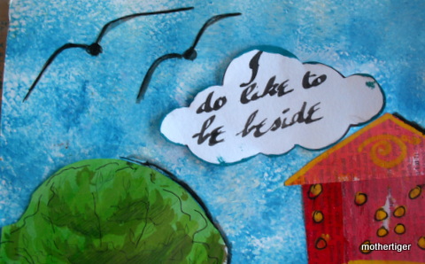
I thought that this quote went really well with the picture of the Hatter that I was doing.  These letter stamps were a bargain find from Target a while ago!


And here's the Hatter!  I drew him and then outlined him with a Pitt pen, then used watercolour.  I love how he's quite crazy looking but also quite cute (I mean Johnny Depp, yes please!).

When I'm sure that he's totally dry, I'll seal the pages using clear shoe polish.  I tried this on some ATC's last week and was pleased with the result - and also pleased that the smell dissipated after a few days!

Hope you like this entry Lisa, it was really enjoyable to do and I think I shall do some more Alice work in the future too!

Thursday, April 14, 2016

Natalie's page in Gail's "Days Gone By' Journal

I chose Holly Hobbie and swapcards as the main ideas to my page. My mum was right into Hobbytex and everything she did was Holly Hobbie based. I had hankies mum had decorated. She even went as far as dressing my baby sister in a Holly Hobbie dress...but she did look cute. Swapcards were pretty big in the 1970's...and I had the hugest collection (mum gave me all hers too). I've still got them. I was also a massive collector of stamps. These stamps were given by one of our Australian Art Swap members.

I played with acrylic paints and water colour in the background. I do hope you like my take on Days Gone By xx


Natalie's page in Robyn's Journal "Travel the World"

I chose Africa as my country I would most like to travel to.  I have never been out of Australia as I believe you could spend a lifetime just travelling around our beautiful country...but if I was to travel, this is where I would want to be.

The lion is the most iconic animal of Africa, and in my opinion, the giraffe is the cutest animal of Africa. I used acrylic and water color paints for the background, and printed my favourite animals. One of our family favourite songs was "Africa" by Toto so it made sense to add my favourite line. I hope you like this page Robyn xx


Friday, April 8, 2016

Joan's page in Lisa's "Enchanted" Journal

I started by using a thick gesso on both pages, as I wanted to use dylusions dyes I was worried they would seep through the previous page.  Even with that, and working with plastic sheets between the previous and next pages, because of the holes in binding it still leaked a little, so I ended up gluing two pages together.


I used spray dyes, dylusions paints, watercolours, gellatos, twinkles and collage on page. 


 The fairy and the Cheshire cat were coloured in using markers. I stamped some flowers and used texture paste with stencil to create some foliage. The title is stuck on and outlined in white and black pen.  The Cheshire cat is designed to stand out away from page if book is standing up and open.  


On the left page I made a pocket with the previous page and put some Alice in Wonderland related journalling cards in there, I used one to sign in, as there is no designated place in journal to do so. I added a little decorated paper clip to close the pocket.


Gail works in Rose's Bird Journal


This is my entry in Rose's bird Journal,
 I had to force myself to stop, hope you like it Rose.


Tuesday, April 5, 2016

Round 3 - Debs Addition to Wendy's Aphorisims Journal

Aphorisms- we are all loving being able to add quotes or sayings we love to our art work and this was the perfect opportunity for me to add one to a journal. I do tend to overthink things and try and be a perfectionist when being arty farty, when sometimes the simplest and easiest option is best. I have always loved the carefree style and colours of Picasso and the fact that he appeared so blase about his works sometimes irked me! Simple is HARD!
So I started with water colour paper I taped off then drew a face with angular lines through it. Looking on Pinterest for common facial features Picasso used, I picked my favorites and added them to the portrait. I then used water colour paints, Posca Paint pens and a black sharpie to finish off.

  
  I then added black acrylic paint to fill in the background of 2 pages of the Journal.                                                                           
                                                                                                                                                          
After the paint dried, I trimmed my portrait and stuck it down onto the first page. I then used Tim Holtz Marquee alphabet thinlit dies, to cut out the letters that formed my aphorism out of bright card stock. I used Matt gel medium to stick them down with and then covered the whole page with more Matt gel medium.


                                                                                                                                                                     At the very end when it had all dried, I used Black Onyx liquid pearl drops to create some texture on  each of the letters. It was something out of my comfort zone but I enjoyed it all the same.


Jan's Page in Vintage Circus for Sharon.


This is such a lovely journal with some gorgeous work already done. I was glad of the wee lull in the Round 2 journals moving their way around Australia because I had to have an operation on the elbow that i broke just over a year ago when round one was going around and was in hospital for a few days and incapacitated. However with Physio and rest it is getting better.

I was given a lovely roll of washi tape for a birthday pressie a while ago and was really happy when Sharon announced the theme as I thought yay! I can use the tape.

Then I thought it would be great to include some of the photos from a show my daughter created all the costumes for in 2010 that was a vintage circus theme. The link to some of the photos is <www.behance.net/gallery/209862/lunamorph-show>
She did an incredible job (her ability to design and sew has me in awe) and all the performers were amazing. I had the strong man, Sharon, but no bearded lady. (That's another photo shoot!)
I base coated the page with Gesso then included my circus washi tape and collaged some vintage papers and then bit more gesso to tone things down.


I then got some frames and cut out the pictures and arranged them. My theme was Postcards To Home. Based on the story line of "They called me a Freak and so I ran away and joined the circus"
Hope you like it. Sorry it is a bit more like a scrapbook page but that's how it worked out. =)


Just discovered the link may not work very well. When you get to Behance.net just search Lunamorph... hope that works


Sunday, April 3, 2016

ROUND 3: Wendy's entry in Pam's MONOTONES

I gave myself rather a hard time doing a page in Pam's journal, mainly because I think I had lost my mojo...pushing myself through it, in the end  I really liked how the double page turned out. I chose my favourite colour tones....yep, purple...lol. I wanted to keep the back ground relatively plain and have the focus on the swirls and then I couldn't decide what to place in the centers. I came up with purple and white tissue flowers with a button in the center. The button is attached with 2 shades of the purple cotton.

There is a border of purple lace and I added some lighter purple flowers in two of the corners.
 The saying on the page says, "Things turn out best for people who make the best out of the way things turn out."
 Full showing of completed layout. Hoping you like it Pam. Thank you.

Friday, April 1, 2016

Travel the World Journal.

I did not do a step by step page.  I hope Robyn likes it.  It was fun to do.

 My destination was Paris France.